
REMI
A calendar app that organizes events, chores, and tasks while letting you share moments and stay engaged.
ROLE
UX/UI Designer
TIMEFRAME
July - August 2025
TOOLS
Figma, paper
Problem
How can families stay organized and connected while making scheduling and household management collaborative and fun?
Remi is trying to solve the challenge of coordination, communication, and engagement in busy households.
Research
User Research
To better understand family needs, I conducted user research through interviews, surveys, and a competitive analysis of existing calendar apps. Parents emphasized the difficulty of managing both schedules and household chores across multiple tools, while kids often disengaged from traditional reminder systems. Insights showed a need for a centralized, easy-to-use platform that keeps families organized, while also making participation fun and motivating for younger members.
Pain Points
🛠️
Scattered tools
Families juggle between calendars, chore charts, and messaging apps, making coordination messy.
📉
Low engagement
Kids and teens often ignore calendar reminders or task lists that feel boring or one-sided.
🧠
Mental load on parents
Parents carry the burden of tracking everyone’s schedules and responsibilities.
🥺
Missed moments
Families lack a simple way to capture and share small, meaningful daily memories in the same place they organize tasks.
Design
Sitemap
For this family calendar app, I grouped features into logical categories—such as Calendar, Profiles, Notifications, To-do Lists, and Settings—so users can easily navigate between core functions.
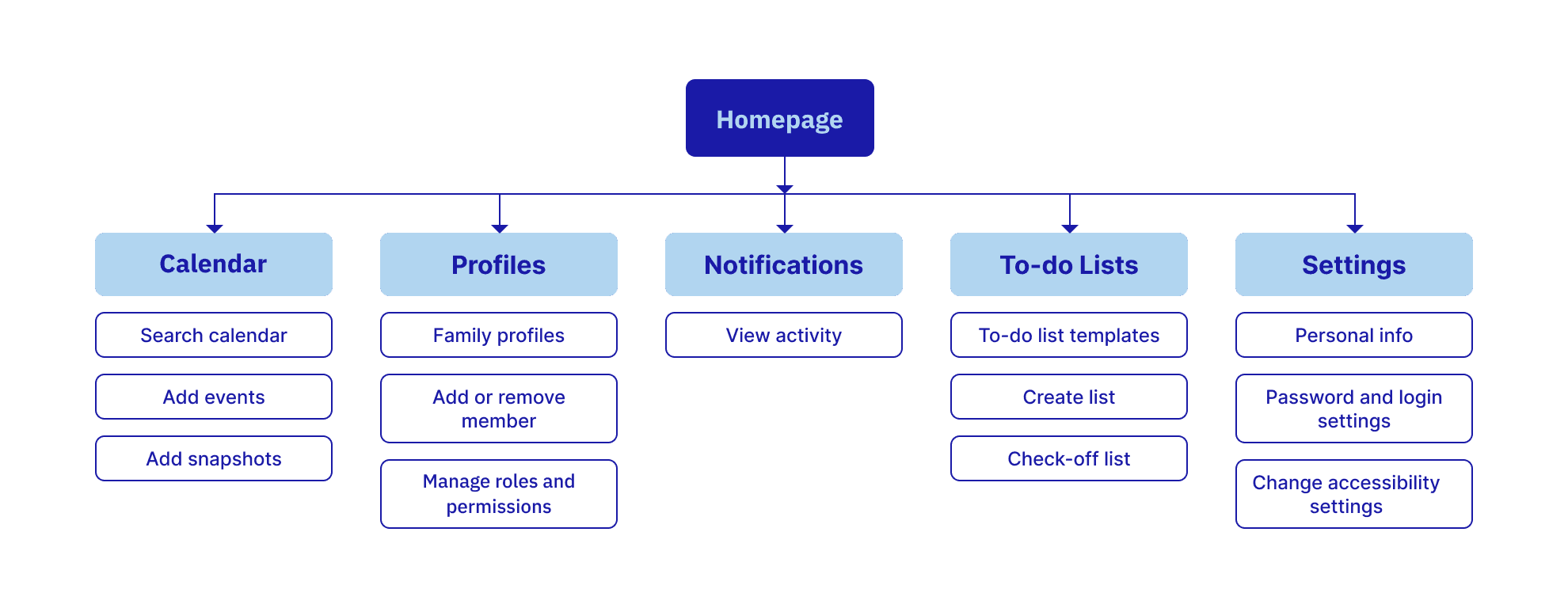
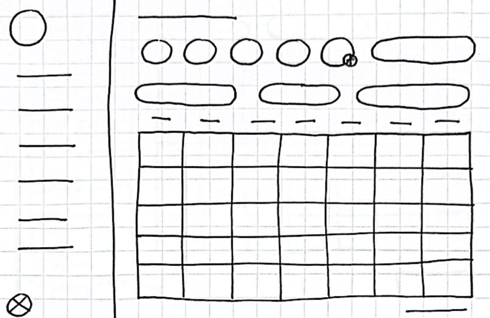
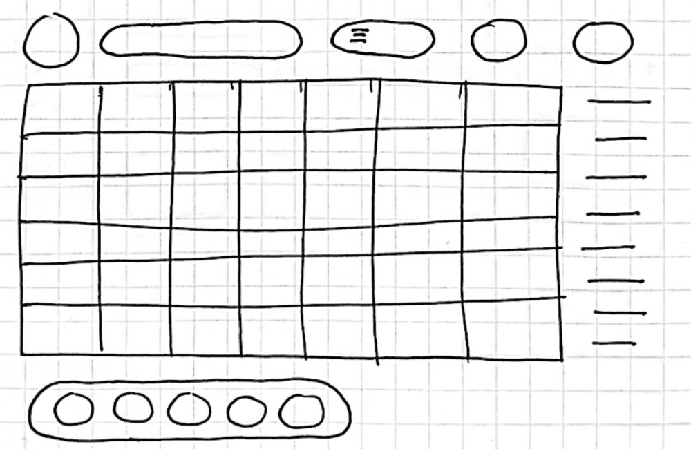
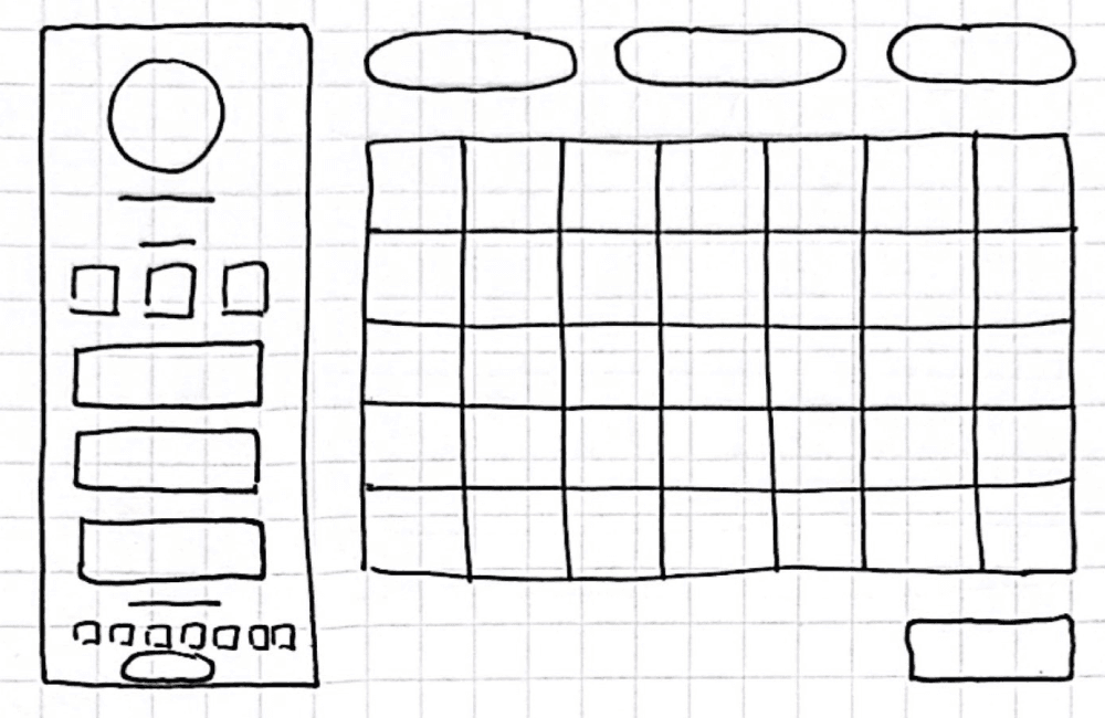
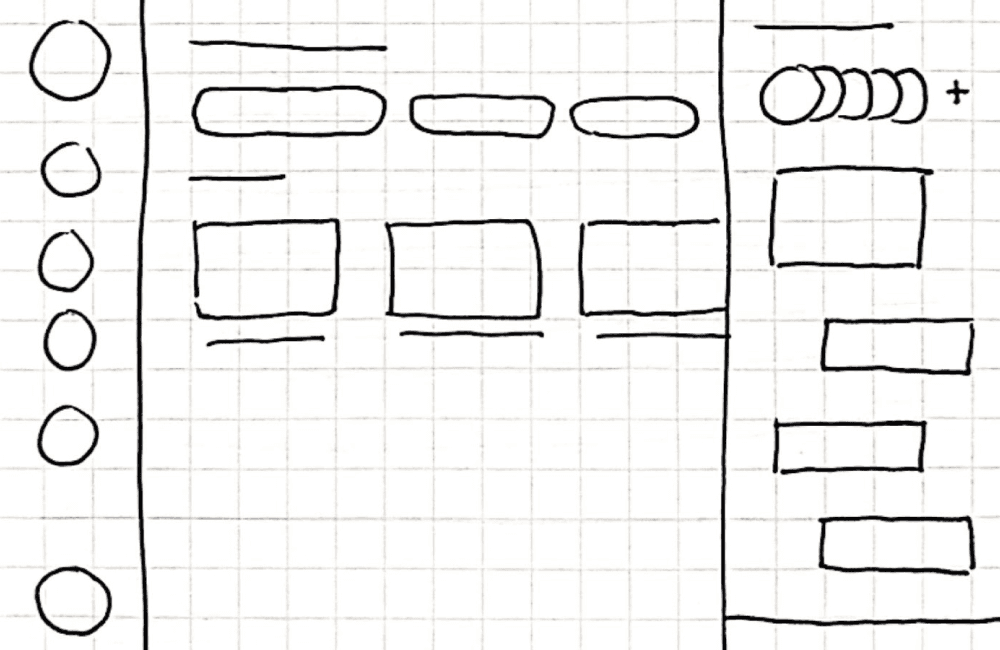
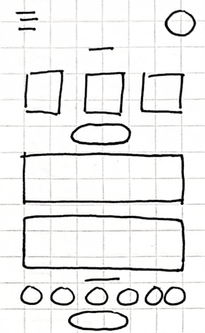
Paper Wireframes
The calendar serves as the core of this wireframe, with the rest of the navigation designed to support and build around it.
Desktop wireframes
Mobile wireframes
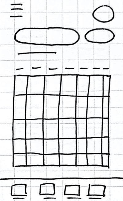
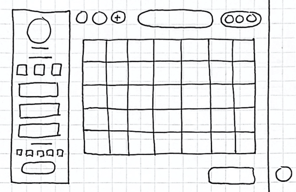
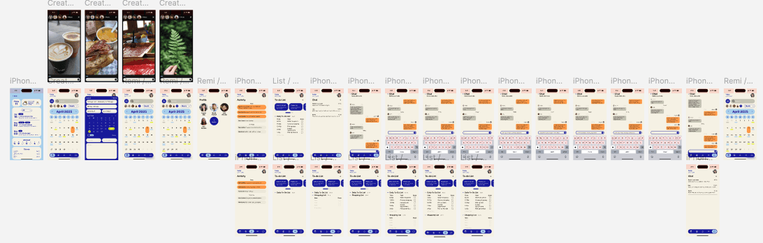
Digital Wireframes
Transitioning from paper to digital wireframes clarified element placement, let me add more details, and gave me a flexible framework to refine the design with user testing insights while ensuring elements linked properly and users could always navigate back.
Digital Wireframes in various screen sizes
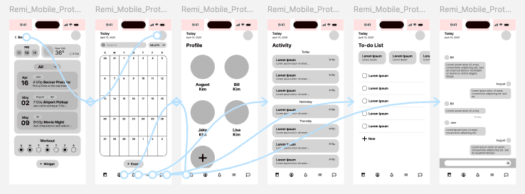
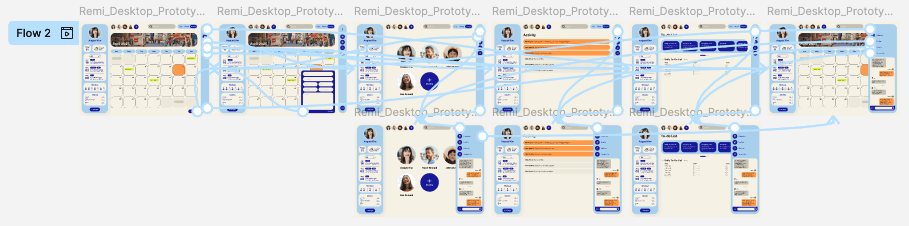
Lo-fi prototype
This low-fidelity prototype demonstrates the transitions between navigation and the app’s different features.
After conducting usability testing, I clarified the navigation, expanded the event creation features, and ensured a seamless experience when moving between desktop and mobile.
Desktop prototype
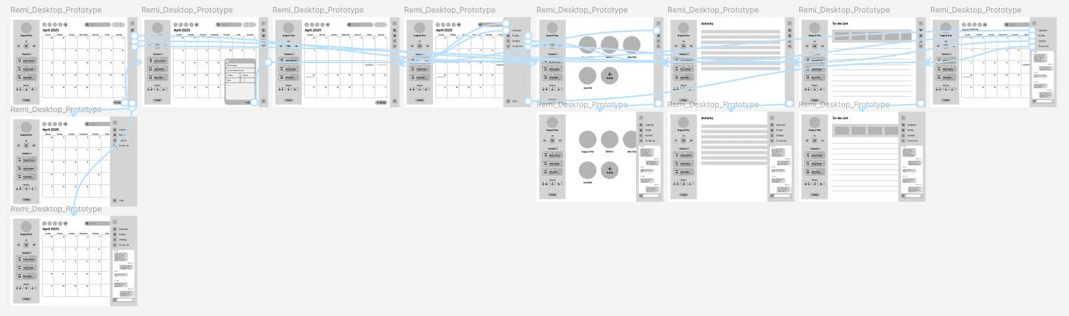
Mobile prototype
Testing
Usability study
Usability testing revealed that event creation was sometimes confusing and navigation wasn’t always clear.
1
Navigation wasn’t clear
Users weren’t sure how to move between tasks, chores, and events.
2
Cross-device consistency
Users expected the experience to feel seamless when switching between desktop and mobile.
3
Back navigation
Some users struggled to return to the previous screen.
Final Design
Key features
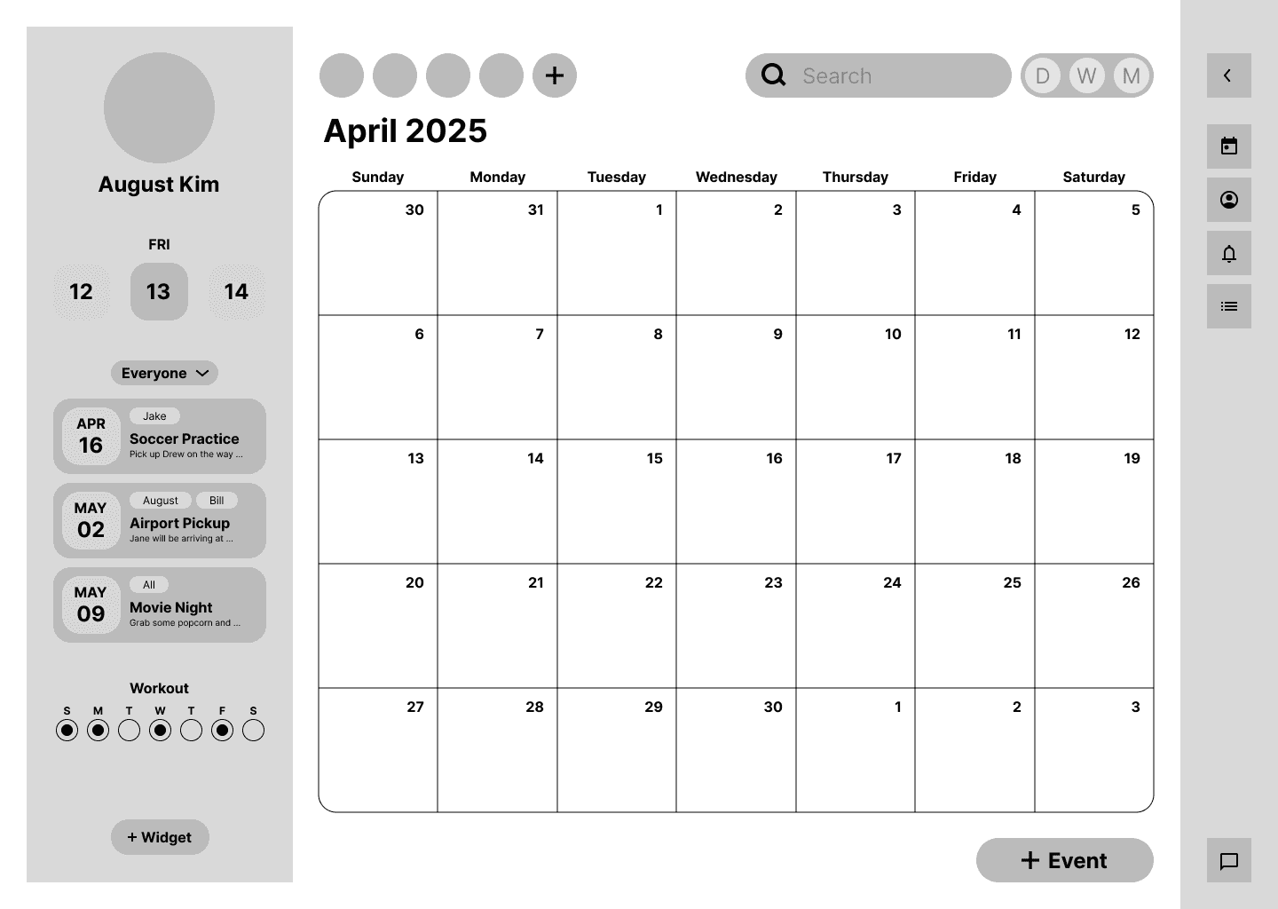
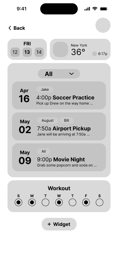
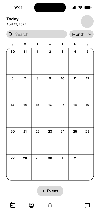
I wanted the interface to be fun and playful for both adults and kids, while still preserving all the essential features and functionality.
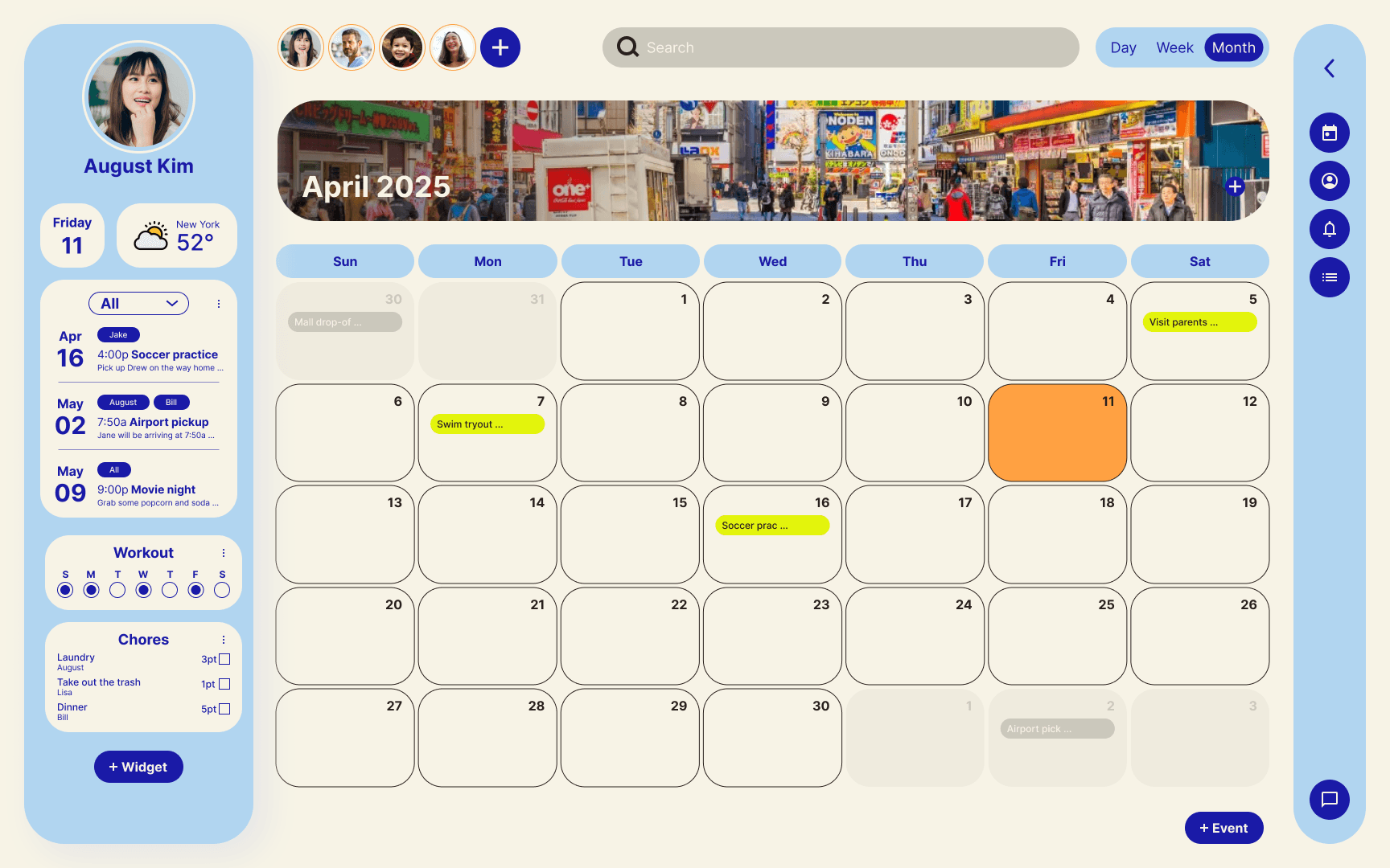
Desktop mockup
Mobile mockup
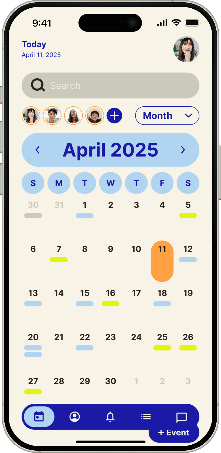
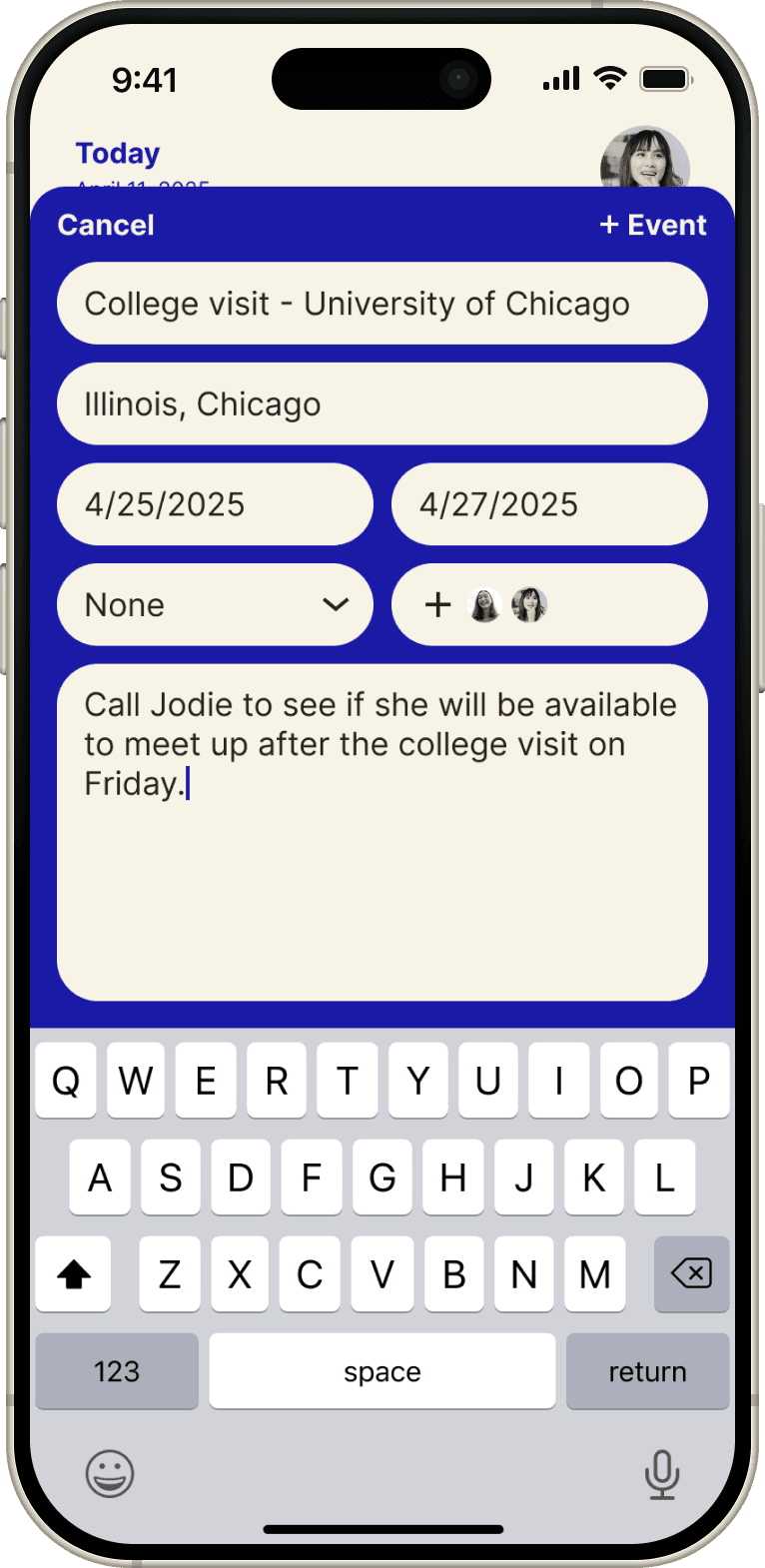
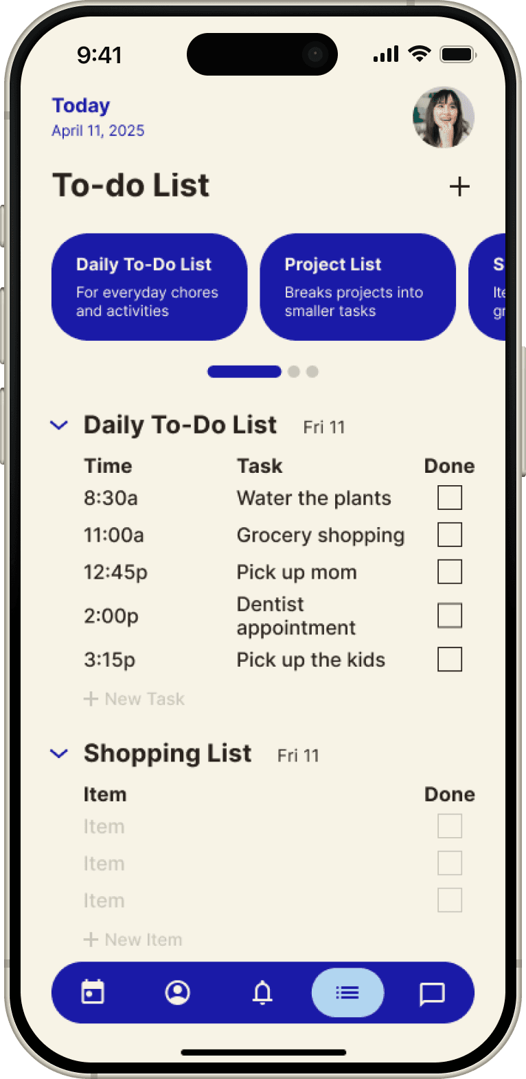
Hi-fi prototype
In this high-fidelity prototype, I ensured the navigation was intuitive and that users could always return to the previous page.
Desktop hi-fi prototype
Mobile hi-fi prototype
Reflection
Impact I’ve made and what I’ve learned
The app helps families coordinate schedules, reduces planning stress, and improves communication. This project reinforced the value of user-centered design and iterative testing, while teaching me how to create intuitive navigation, maintain consistency across devices, and consider accessibility for all users.